Covid-19 Symptoms Similarity in Other Medical Conditions (with Kevin Pennington)
In this, we attempted to investigate major symptoms of Covid-19 and other illnesses of significant spread and compare how different individual symptoms and combinations of symptoms increase or decrease likelihood of Covid-19 diagnosis.
We gather publicly available up-to date data for COVID and other similar prevalent or widespread/fatal medical conditions for symptoms, number of US cases, and number of US deaths. However, limited symptom lists for conditions made traditional data extraction methods difficult. In addition, lack of detailed and accurate consensus on symptoms and signs across sources proved using singular sources not viable. Even official CDC records (from the Centers for Disease Control and Prevention website and archives) were not always extensive nor consistent, with much of the conditions statistics outdated and lacking.
As a solution, we pooled and cross-referenced information from multiple sources, including the CDC website, various NCBI research papers, and reputable healthcare websites such as MayoClinic and WebMD. We combined symptom lists from more than one healthcare website source to be more consistent and extensive versus being reliant on only one. In addition, we updated outdated conditions for estimated cases and mortality rates based on past statistics. In one excel sheet, different conditions were compiled with a list of total symptoms as well as degree of symptom sensitivity for each symptom. In a second excel sheet, conditions contained information on number of cases and number of deaths per year in the US.
We implemented our visualization using Seaborn on Python, and looking first at death count and mortality rate between the conditions we have collected: COVID19, Pneumonia, Flu, Tuberculosis, Bronchial Asthma, Bronchitis, Strep Throat, Measles, Mononucleosis, Lyme Disease, and Meningitis.
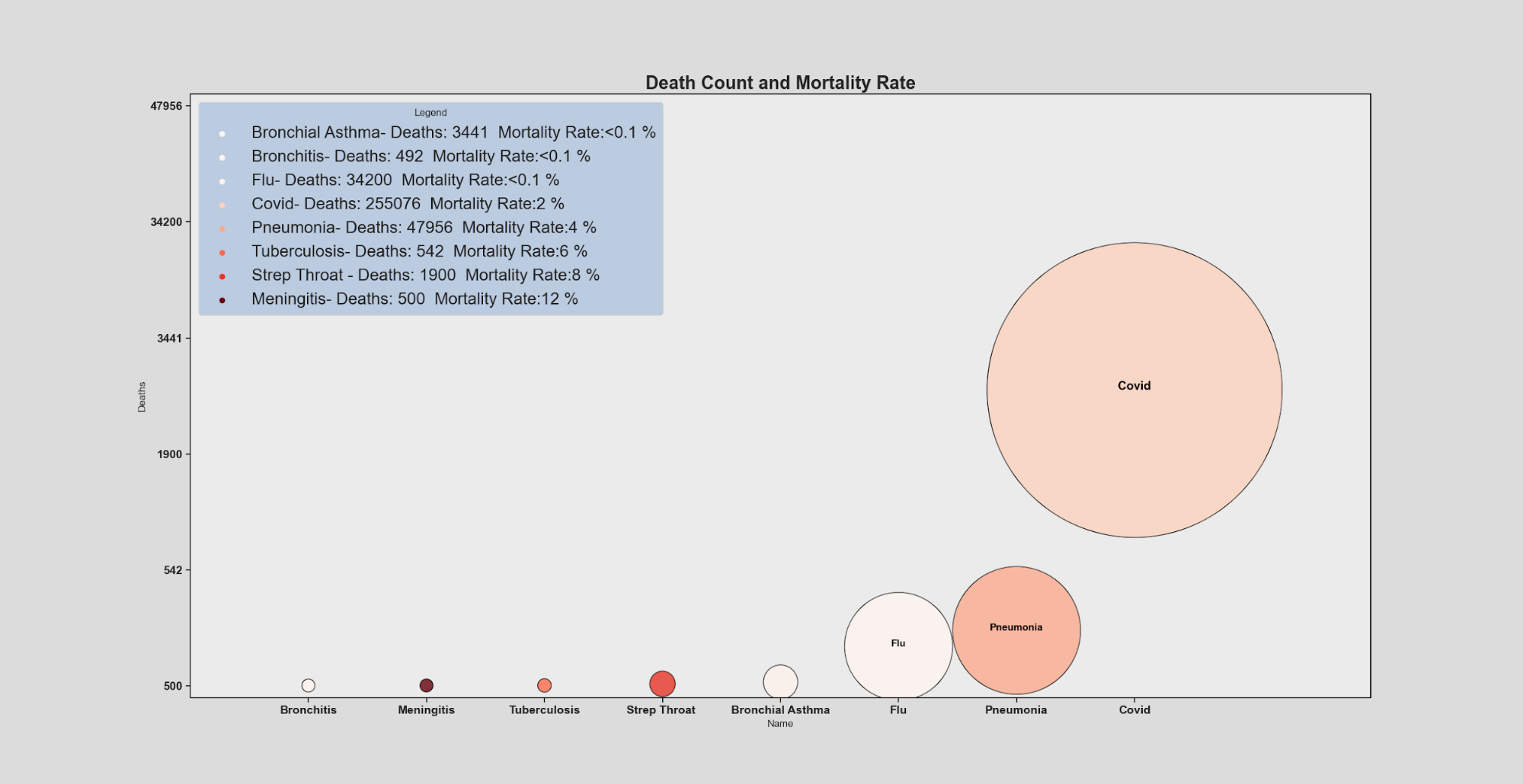
In this visualization, the height of each condition and size reflects the number of deaths (with higher position in the Y axis representing a higher death count) and the area covered by each condition scaled to the death count to give easy relative comparison between conditions with numerical values included in the legend for reference. Lastly, the darkness of the red hue of each condition represents an increasing mortality rate going lightest to darkest being the most deadly.
df = pd.read_csv("data2.csv")
print(df.dtypes)
print(df.head)
df['Cases'] = df['Cases'].str.replace(',', '').astype(int)
df['Deaths'] = df['Deaths'].str.replace(',', '').astype(int)
df=df.sort_values('Deaths')
print(df.head)
sns.set_theme(style="ticks",rc={"axes.facecolor": ".92",'figure.facecolor':'gainsboro','axes.edgecolor':".1"})
ax = sns.scatterplot(x="Name", y=df['Deaths'], data=df, s=df["Deaths"]/2,hue=(df['Deaths']/df['Cases']),legend="full",alpha = 0.8,palette=sns.color_palette(palette="Reds",as_cmap = True),linewidth=1,edgecolor='black',facecolor='black')
maxY=max(df['Deaths'])*2
ax.set(ylim=(-10000, maxY),xlim=(-1,9))
ax.legend(prop={'size': 20},frameon=True,loc = 'upper left')
ax.set_title("Death Count and Mortality Rate",fontsize = 22,weight='semibold')
legend = ax.get_legend()
legend.set_title("Legend")
frame = legend.get_frame()
frame.set_facecolor('lightsteelblue')
for t, l in zip(legend.texts,( "{}- Deaths: {}  Mortality Rate:<0.1 %".format(df['Name'][4],df['Deaths'][4],round((df['Deaths'][4]/df['Cases'][4])*100)),
                             "{}- Deaths: {}  Mortality Rate:<0.1 %".format(df['Name'][5],df['Deaths'][5],round((df['Deaths'][5]/df['Cases'][5])*100)),
                             "{}- Deaths: {}  Mortality Rate:<0.1 %".format(df['Name'][1],df['Deaths'][1],round((df['Deaths'][1]/df['Cases'][1])*100)),
                             "{}- Deaths: {}  Mortality Rate:{} %".format(df['Name'][0],df['Deaths'][0],round((df['Deaths'][0]/df['Cases'][0])*100)),
                             "{}- Deaths: {}  Mortality Rate:{} %".format(df['Name'][3],df['Deaths'][3],round((df['Deaths'][3]/df['Cases'][3])*100)),
                             "{}- Deaths: {}  Mortality Rate:{} %".format(df['Name'][2],df['Deaths'][2],round((df['Deaths'][2]/df['Cases'][2])*100)),
                             "{}- Deaths: {}  Mortality Rate:{} %".format(df['Name'][6],df['Deaths'][6],round((df['Deaths'][6]/df['Cases'][6])*100)),
                             "{}- Deaths: {}  Mortality Rate:{} %".format(df['Name'][7],df['Deaths'][7],round((df['Deaths'][7]/df['Cases'][7])*100)))):
   t.set_text(l)
ax.text(df.Name[0], df.Deaths[0], df.Name[0], horizontalalignment='center', size='large', color='black', weight='semibold')
ax.text(df.Name[1], df.Deaths[1], df.Name[1], horizontalalignment='center', size='medium', color='black', weight='semibold')
ax.text(df.Name[3], df.Deaths[3], df.Name[3], horizontalalignment='center', size='medium', color='black', weight='semibold')
ax.set_xticklabels(df['Name'], fontsize = 14,weight='semibold')
ax.set_yticklabels(df['Deaths'], fontsize = 14,weight='semibold')
plt.show()
Following the previous visualization, this time we create a visualization based on case and death count. In this, each condition’s number of cases is represented by the size of the sphere, with the outer sphere being case count and color hue corresponding to mortality rate, while the inner sphere corresponds to death count giving a good visualization of the proportion rather than a pure numerical percent.

df = pd.read_csv("data1.csv")
print(df.dtypes)
print(df.head)
df['Cases'] = df['Cases'].str.replace(',', '').astype(int)
df['Deaths'] = df['Deaths'].str.replace(',', '').astype(int)
df=df.sort_values('Cases')
print(df.head)
sns.set_theme(style="ticks",rc={"axes.facecolor": ".92",'figure.facecolor':'gainsboro','axes.edgecolor':".1"})
ax = sns.scatterplot(x="Name", y=df['Cases'], data=df, s=df["Cases"]/512,hue=(df['Deaths']/df['Cases']),legend="full",alpha = 0.8,palette=sns.color_palette(palette="flare",as_cmap = True),linewidth=1,edgecolor='black',facecolor='black')
ax = sns.scatterplot(x="Name", y=df['Cases'], data=df, s=df["Deaths"]/512,hue=(df['Deaths']/df['Cases']),legend=False,alpha = 0.95,palette=sns.color_palette(palette="mako",as_cmap = True),linewidth=1,edgecolor='black',facecolor='black')
maxY=max(df['Cases'])*2
ax.set(ylim=(-2000000, maxY),xlim=(-1,13))
ax.legend(prop={'size': 20},frameon=True,loc = 'upper left')
ax.set_title("Case Count And Death Count",fontsize = 22,weight='semibold')
legend = ax.get_legend()
legend.set_title("Legend")
frame = legend.get_frame()
frame.set_facecolor('lightsteelblue')
for t, l in zip(legend.texts,( "{}- Cases: {}  Mortality Rate:<0.1 %".format(df['Name'][4],df['Cases'][4],round((df['Deaths'][4]/df['Cases'][4])*100)),
                             "{}- Cases: {}  Mortality Rate:<0.1 %".format(df['Name'][5],df['Cases'][5],round((df['Deaths'][5]/df['Cases'][5])*100)),
                             "{}- Cases: {}  Mortality Rate:<0.1 % %".format(df['Name'][7],df['Cases'][7],round((df['Deaths'][7]/df['Cases'][7])*100)),
                              "{}- Cases: {}  Mortality Rate:<0.1 % %".format(df['Name'][8], df['Cases'][8], round((df['Deaths'][8] / df['Cases'][8]) * 100)),
                              "{}- Cases: {}  Mortality Rate:<0.1 % %".format(df['Name'][9], df['Cases'][9], round((df['Deaths'][9] / df['Cases'][9]) * 100)),
                             "{}- Cases: {}  Mortality Rate:<0.1 %".format(df['Name'][1],df['Cases'][1],round((df['Deaths'][1]/df['Cases'][1])*100)),
                             "{}- Cases: {}  Mortality Rate:{} %".format(df['Name'][0],df['Cases'][0],round((df['Deaths'][0]/df['Cases'][0])*100)),
                             "{}- Cases: {}  Mortality Rate:{} %".format(df['Name'][3],df['Cases'][3],round((df['Deaths'][3]/df['Cases'][3])*100)),
                             "{}- Cases: {}  Mortality Rate:{} %".format(df['Name'][2],df['Cases'][2],round((df['Deaths'][2]/df['Cases'][2])*100)),
                             "{}- Cases: {}  Mortality Rate:{} %".format(df['Name'][6],df['Cases'][6],round((df['Deaths'][6]/df['Cases'][6])*100)),
                              "{}- Cases: {}  Mortality Rate:{} %".format(df['Name'][10], df['Cases'][10], round((df['Deaths'][10] / df['Cases'][10]) * 100)),
                              )):
   t.set_text(l)
ax.text(df.Name[1], df.Cases[1]*1.25, df.Name[1], horizontalalignment='center', size='large', color='black', weight='semibold')
ax.text(df.Name[0], df.Cases[0]*1.25, df.Name[0], horizontalalignment='center', size='large', color='black', weight='semibold')
ax.text(df.Name[8], df.Cases[8]*1.25, df.Name[8], horizontalalignment='center', size='large', color='black', weight='semibold')
ax.text(df.Name[5], df.Cases[5]*1.25, df.Name[5], horizontalalignment='center', size='large', color='black', weight='semibold')
ax.set_xticklabels(df['Name'], fontsize = 14,weight='semibold')
ax.set_yticklabels(df['Cases'], fontsize = 14,weight='semibold')
plt.show()
We also compared symptom sensitivity between COVID19 and influenza to analyze and compare the percentage of positively tested patients that have certain symptoms. Originally the symptoms have been organized in ascending height by the flu attribute, but since our topic focuses on COVID, we have reordered the symptoms based on COVID symptom priority.
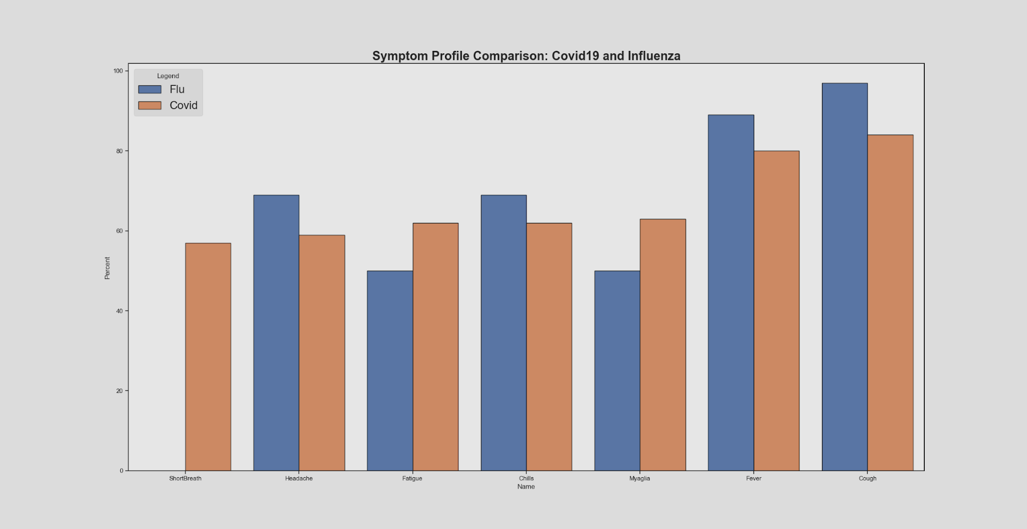
It is important to note that these symptoms are only for symptomatic COVID19 patients, and that most people who have COVID19 are asymptomatic. Looking at this visual, we can see that overall the symptom sensitivity between COVID19 and influenza are very similar. From this information alone it would be somewhat difficult to make a clear statement about diagnosis and helps explain why COVID19 became a disease requiring lab testing for diagnosis confirmation..
On top of this, measles are another form of illness that have common symptoms with COVID19, such as fever and coughing. However, the symptom profile comparison between the two may reflect that even though there are similarities between COVID19 and measles symptoms, the key differences lie in the presence of rashes that support a measles diagnosis as opposed to a COVID19 diagnosis. The main contributor to diagnosis here lies in the prevalence of “signs” abnormalities that may indicate a specific medical condition that would require more human knowledge than a list of symptoms may suggest that is not readily available for non-medical professionals to access.
df = pd.read_csv('CovidFluSympt.csv')
print(df.dtypes)
print(df.head)
df=df.sort_values('Percent')
print(df.head)
sns.set_theme(style="ticks",rc={"axes.facecolor": ".9",'figure.facecolor':'gainsboro','axes.edgecolor':".1"})
ax = sns.barplot(x="Name", y="Percent", hue="Disease", data=df,palette='deep',linewidth=1,edgecolor='black')
ax.legend(prop={'size': 20},frameon=True,loc = 'upper left')
ax.set_title("Symptom Profile Comparison: Covid19 and Influenza",fontsize = 22,weight='semibold')
legend = ax.get_legend()
legend.set_title("Legend")
frame = legend.get_frame()
frame.set_facecolor('lightgrey')
plt.show()
Here we compare COVID symptom profiles with other medical conditions mentioned earlier based merely on the presence or absence of certain symptoms found in COVID19. The rightmost bar displays COVID19 symptoms and all the colored bars for each individual symptom (headache, fever,etc). This provides a good visualization of the degree of similarity between COVID and the other diseases we compared it to.

df = pd.read_csv("CovidFluSympt3.csv")
print(df.head())
print(df)
ax=df.set_index('Name')\
 .reindex(df.set_index('Name').sum().sort_values().index, axis=1)\
 .T.plot(kind='bar', stacked=True,
         color=sns.color_palette(palette="Paired"),
         figsize=(12,6))
df2 = pd.read_csv("data1.csv")
ax.set_title("Covid Symptom Profile",fontsize = 22,weight='semibold')
lab = ax.get_xticklabels()
ax.set_xticklabels(lab,rotation=0,fontsize = 14,weight='semibold')
ax.set(ylabel='Number of Covid Symptoms', xlabel='Disease')
plt.show()
In conducting the research for this project we quickly became aware of multiple limitations both caused by our project idea and by our health system as a whole. Chief among those and perhaps the root cause for most is that covid-19 is really the first epidemic or disease in general that is regularly and at mass scale tested for laboratory confirmation of a diagnosis. Previously the system of disease diagnosis usually went along the lines of going to see your local doctor and essentially filling out a checkbox of symptoms for the doctor to make an educated guess at the diagnosis (eg., influenza), all without ever once sending in a blood sample or getting a laboratory confirmed result for the diagnosis. This complicates our project in multiple ways however primarily and most impactfully it makes it so that without a laboratory confirmation it adds a degree of uncertainty whenever viewing symptom data that doesn’t disclose if the diagnosis was confirmed and without a confirmation it’s easier to see why there is so little in the way of percentile and statistical data publicly available about the symptoms and even less so when you include multi-symptom combinations data as few would publish such data without the diagnosis confirmation. In addition, since the confirmation is not standard practice, it adds a large burden on any researchers wishing to publish such data and even more so when that level of breakdown while helpful in our projects case was likely seen as pointless and of minimal medical use although that is likely to change with the rapid advancements of machine learning and programs that would actually benefit from better breakdowns of the data. Ultimately, standardization of medical information is desperately needed and would drastically improve and advance our current primitive system.
The ongoing epidemic of covid-19 is itself a major hurdle, not only does it shadow all our research and data with the fact it is ultimately incomplete and to an impossible-to-know degree but also limits our ability to compare and contrast with other diseases as our original project idea had intended. The simple reality is that very few diseases even come close to covid 19 in scale both case count wise and death count, with the exception of influenza, mono, and bronchitis every other modern disease with covid symptoms we compared to either has a negligible case count, death count or both when placed in relation to covid-19 to the point that comparing them without seeming pointless becomes impossible eg tuberculosis with its ~9 Thousand cases a year compared to covid’s at the time of this project’s data collection 12 Million cases even a symptom with a 100% rate in Tuberculosis and a 0.1% rate in Covid would still have covid as the more likely disease adjusted for their population. Previous epidemics are also incomparable as they either have the same negligible case size no matter their public opinion impact eg ebola and zika virus, or they’re so far in the past that accurate data is dubious at best eg the spanish flu.
By analyzing symptom sensitivity as a measure for symptom comparison, researchers can further analyze conditions in a detailed measure and open a more accessible avenue for specification. We encourage studies on symptom sensitivity in future works, as well as the inclusions of signs more widely accessible, and more accurate predictions on condition diagnosis. Popular healthcare news publications, however, do not easily disclose signs (note-worthy indicators that may point to a specific condition) and only list out symptoms. The inclusion of signs in media would allow public citizens to be more informed individuals, decrease anxiety and online self-diagnosis, and allow professionals to access information effectively for a more accurate diagnosis (distributed cognition). With the rise of artificial intelligence and computer-based diagnosis, more information on symptoms, signs, and other indicators for diagnosis to be clear and precise is paramount for healthcare advancement. In this regard is especially important to start lab testing and confirmation of a disease for diagnosis as standard practice and collecting of statistical data on symptom breakdown so future advancements in machine learning can be fully utilized to assist researchers in this field.
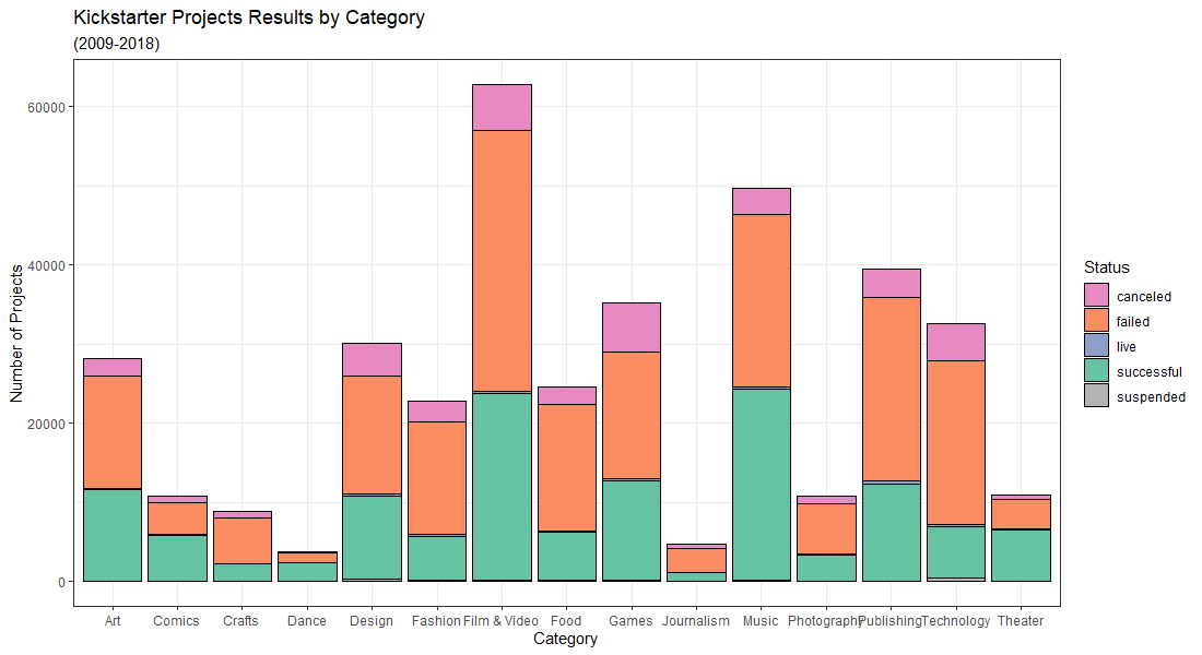
Kickstarter Projects Dataset
Created a visualization on Kickstarter projects using ggplot2 in R. Dataset obtained from here.
library(ggplot2)
library(RColorBrewer)

# Load data
kickstarterdata = read.csv("C:\\Users\\Emily Chen\\Documents\\RStudio_Projects\\kickstarter-projects-2018.csv")
# Data exploration
summary(kickstarterdata)
head(kickstarterdata)
min(kickstarterdata$launched) # todo: remove 1970 "null" values
# Remove undefined/impossible values
# Remove 1970 attributes, as well as those with undefined state.
kickstarterdata2<-kickstarterdata[!(kickstarterdata$launched == "1970-01-01 01:00:00" | kickstarterdata$state == "undefined"),]
min(kickstarterdata2$launched)

brewer.pal(12, "Set2")
display.brewer.pal(12, "Set2")
colors <- c("canceled" = "#E78AC3", "failed" = "#FC8D62", "live" = "#8DA0CB", "successful" = "#66C2A5", "suspended" = "#B3B3B3")


d <- ggplot(data = kickstarterdata2,
            mapping = aes(main_category))
d + geom_bar(aes(fill = state), colour = "black") + theme_bw() +
  scale_fill_manual(values = colors) +
  labs(title = "Kickstarter Projects Results by Category",
       subtitle = "(2009-2018)",
       x = "Category",
       y = "Number of Projects") + guides(fill=guide_legend(title="Status"))
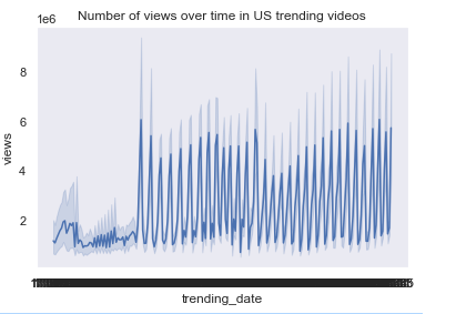
US Trending Videos Dataset
Created two charts, this time in Python on the US Trending Videos dataset obtained from here
import pandas as pd
import numpy as np
from matplotlib import pyplot as plt
import seaborn as sns
from seaborn import lineplot

# Import dataset
df = pd.read_csv('USvideos.csv', index_col=0)
df.head()

sns.set(style="dark")
# Line Chart (views over time)
f = lineplot(x='trending_date', y='views', data=df)
plt.title('Number of views over time in US trending videos')
plt.show()
# Line histogram (likes versus dislikes)
grid = sns.lmplot('likes','dislikes', df, size=7, truncate=True)
plt.title('Relationship between likes and dislikes in US trending videos')
plt.show() 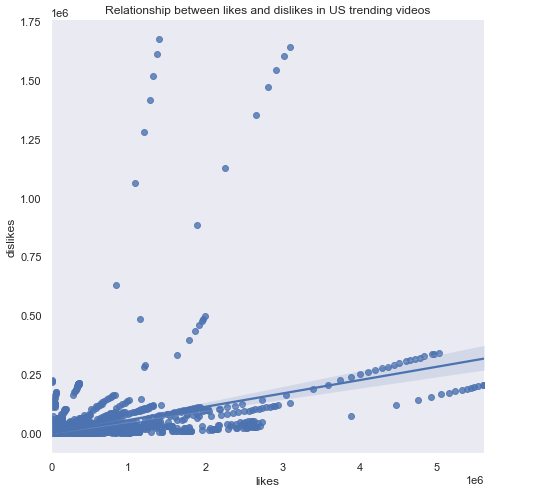
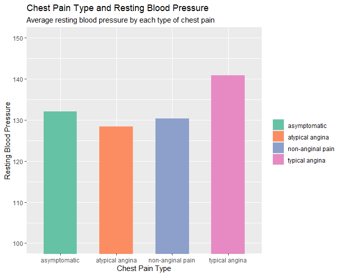
Health Disease Dataset
I created two charts in R on the Heart Disease dataset obtained from here.
First, we start with importing the data and recoding some of the values into more descriptive categories.
library(ggplot2)

heartdata = read.csv("C:\\Users\\Emily Chen\\Documents\\RStudio_Projects\\heart.csv")

colnames(heartdata) # here we see the first column has a strange name "ï..age" so we rename
names(heartdata)[1] <- "age" # rename the column appropriately
heartdata$cp[heartdata$cp == "0"] <- "asymptomatic"
heartdata$cp[heartdata$cp == "1"] <- "atypical angina
heartdata$cp[heartdata$cp == "2"] <- "non-anginal pain"
heartdata$cp[heartdata$cp == "3"] <- "typical angina"
heartdata2 <- aggregate(trestbps ~ cp, data=heartdata,FUN=mean)
heartdata2
Now we are ready to make our charts!
# Column Chart (chest pain type x rest blood pressure)
# layers, aesthetoc, type of graph, coord_cartesian for axis zoom, scale_fill for color palette, labs for
labels.
p <- ggplot(data=heartdata2, aes(x=cp, y=trestbps, fill=cp)) + geom_bar(stat="identity", width = 0.6) +
coord_cartesian(ylim=c(100,150)) + scale_fill_brewer(palette ="Set2")
p + labs(title="Chest Pain Type and Resting Blood Pressure", subtitle="Average resting blood pressure by
each type of chest pain.", x="Chest Pain Type", y="Resting Blood Pressure") +
guides(fill=guide_legend(title=NULL))
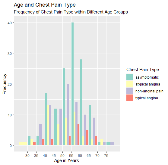
# Variable with column chart (age x chest pain type x frequency)
o <- ggplot(data=heartdata, aes(age, fill=cp)) + geom_bar(position=position_dodge()) + scale_x_binned() +
scale_fill_brewer(palette ="Set3")
o + labs(title="Age and Chest Pain Type", subtitle="Frequency of Chest Pain Type within Different Age
Groups", x="Age in Years", y="Frequency") + guides(fill=guide_legend(title="Chest Pain Type"))
Stephen Malinowski’s Bach, Fugue in A minor, BWV 904 Visualization Review
COVID-19 Symptoms and Similarities Project Proposal
Teaching to See
- Difference between geometric accuracy and optical accuracy
- Usage of negative space for balance and harmony
- Importance of common structure and evenness throughout piece
- Sufficiently distinct objects to ensure readability
- Proper optical spacing between objects with usage of rhythm and color
- Using color intelligently: balance of hue, saturation to convey different messages
- Different types of info can live together without harming each other
- Objective to capture attention of someone walking by
- Should entice to look at more detailed information
- For data visualization, sparking knowledge and curiousity for audience
Journalism in the Age of Data
Welcome to GitHub Pages
You can use the editor on GitHub to maintain and preview the content for your website in Markdown files.
Whenever you commit to this repository, GitHub Pages will run Jekyll to rebuild the pages in your site, from the content in your Markdown files.
Markdown
Markdown is a lightweight and easy-to-use syntax for styling your writing. It includes conventions for
Syntax highlighted code block
# Header 1
## Header 2
### Header 3
- Bulleted
- List
1. Numbered
2. List
**Bold** and _Italic_ and `Code` text
[Link](url) and 
For more details see GitHub Flavored Markdown.
Jekyll Themes
Your Pages site will use the layout and styles from the Jekyll theme you have selected in your repository settings. The name of this theme is saved in the Jekyll _config.yml configuration file.
Support or Contact
Having trouble with Pages? Check out our documentation or contact support and we’ll help you sort it out.